Precious Metals: Gold Is Basing For Next Bullish Wave
In 2019, one of the market’s most surprising stories has been the massive bull trend movement that has been established in gold. Additionally, a series of unpredictable changes occurred in the realm of monetary policy, as the Federal Reserve has already broken with its long-standing position to raise interest rates as a way of preempting continued expectations for growth. In the U.S., the latest evidence in the national GDP readings implies growth rates that are close to zero for the fourth quarter. Overall, this is not a bullish scenario for stocks —even with the S&P 500 trading near its record highs.
My regular readers know that I often tend to look at market inflow activity in some of the precious metals industry’s most popular exchange-traded funds (ETFs). This would also include instruments like the VanEck Gold Miner’s ETF, which is a topic I have discussed in a prior article. Ultimately, this type of approach to baseline fundamental analysis can provide important clues that help identify price trends that are likely to begin reversing relatively soon.
Most directly, we can see that recent activity in the SPDR Gold Trust ETF (NYSE: GLD) has shown outflows worth $1,308.7 million over the last four weeks. However, this figure might paint a very different picture when compared to various time horizons. In the last 13 weeks, GLD has seen inflows of $2,330.9 million but this figure actually grows to $7,191.3 million over the past 26 weeks. Overall, these are significant differences that give us a fundamental reason to believe that there will be underlying strength in any technical trading events that are generated as a result of 2019’s bullish trend moves.

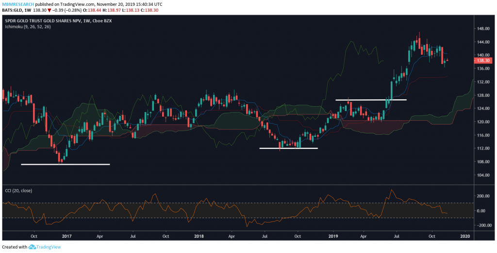
Traders should define the major rallies in precious metals as a development the occurred after the beginning of summer. However, the true origins of that really actually began much earlier (as commodities markets were confirming their lows near the end of 2017). In this chart, I have outlined a series of levels that could prove to be pivotal in the event we see a true bearish reversal in the price of precious metals.
Using the price valuations in GLD, we can isolate these important price levels as falling near $106.80, $112.05, and $126.50. This first level marks the lows from December 2016 while the second level marks the lows from August and September 2018. The third level on the GLD price chart shown above is meant to mark the highs from February 2019. This final price zone will now be expected to act as support once the GLD valuation overcame resistance at these levels.

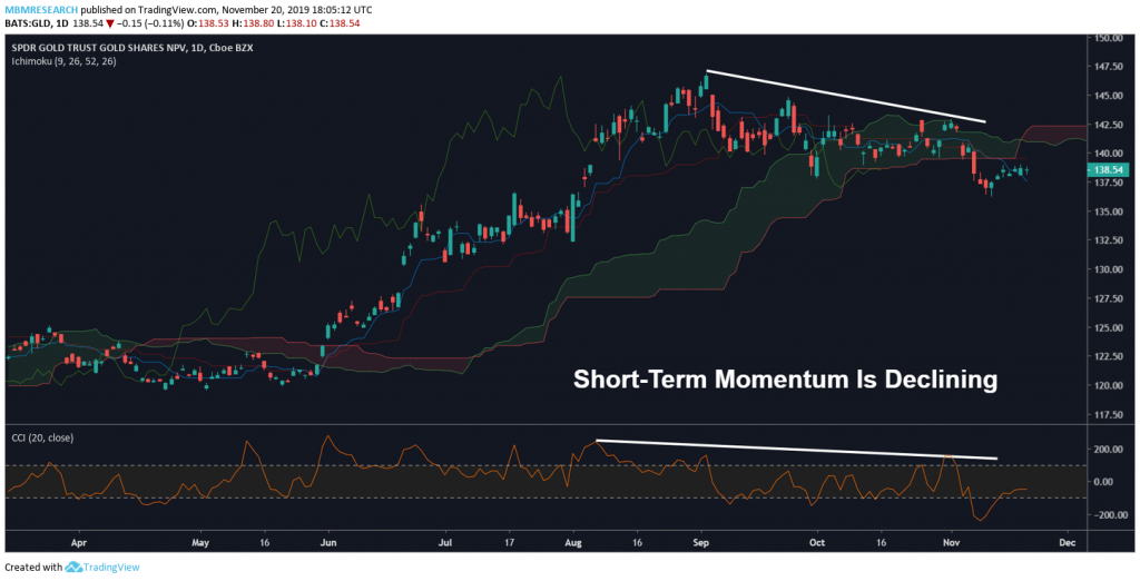
Shorter-term, the confluence of these technical factors suggest we are likely to begin basing above the $126.50 region. Evidence supporting the bearish outlook would include the slowing momentum levels that are present on the daily charts. In my own trading, I will be paying special attention to the technical indicator readings in the Commodity Channel Index (or CCI). I expect to see the first clues of short-term reversal in the CCI reading. Longer-term charts (weeklies) are clearly positive and it seems to be just a matter of time before that prior uptrend resumes.
Initial resistance levels suggest traders will likely target $147.10, which was the price high from September. However, the price targets that could be reached if these levels are broken could be outrageous. Long-term readings in market momentum remain favorable and the short-term retracements we have seen to the downside could create some new buying opportunities in the weeks ahead. For additional information on how I use the Commodity Channel Index to gauge price momentum, readers might be interested to see my Momentum Trading Tutorial which explains in greater depth some of the ways these technical charting tools should be interpreted.


